SimplyAnalytics is a mapping, analytics, and data visualization application that makes it easy for anyone to create interactive maps and reports using thousands of demographic, business, and marketing variables.
To access SimplyAnalytics at the Pike Peak Libarary, from their homepage go to “Reasearch & Learn” and select “Seatch by Subject”
Then “Business Resources.”
Then select “Business Databases”
Finally, select “SimplyAnalytics.”
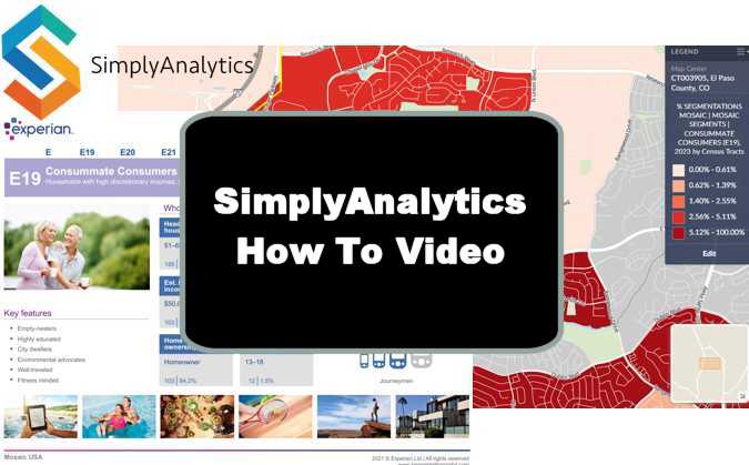
The following is the Tutorial Video
Abridged Transcript (Full Transcript Follows):
Hey, welcome to SteveBizBlog. I’m Steve Imke, and today I want to show you how to use an awesome market research tool called SimplyAnalytics. While individual business owners can license it, many public libraries offer free access to their patrons. For this demo, I’m accessing it through the Pikes Peak Library District, where I live.
Getting Started with SimplyAnalytics
The first time you use SimplyAnalytics, you can sign in as a guest, but I don’t recommend it. You won’t be able to save your data between sessions. Instead, create a free account so you can log in and access all your saved work.
Once you’re logged in, you’ll land on your dashboard. This is where you’ll start a new project or open previous ones.
To begin, click “New Project.” The first step is to select a location — in my case, I’ll use Colorado Springs. The tool preloads a variety of data, but I suggest you start with Total Population just to create a baseline for your project.
Once loaded, you’ll see a map view of Colorado Springs with color-coded segments representing population density. You’ll also want to give your project a name — for this tutorial, I’m naming it “Cleaning Company.”
Exploring Customer Archetypes with Simmons Mosaic
Before diving into data, I want to highlight some fantastic supporting tools inside SimplyAnalytics.
Go to the Support tab and click “Data Documentation.” Here, you’ll find valuable PDFs that explain different datasets. The one I highly recommend is the Simmons Mosaic Group and Type List.
This 118-page document categorizes U.S. households into Groups and Types based on behavioral and spending data. For example, “Power Elite” is a group, and “American Royalty” is one of the types within it.
Each group has a narrative description, including how to market to them — very useful. You can search by interest (e.g., “museum,” “reading,” “beach”) to match audiences to your business. Later in the document, each Type within a group gets its own in-depth write-up.
Using the Simmons Mosaic Handbook
Another helpful resource is the Simmons Mosaic Handbook — a 188-page reference organized like a grid:
High income is at the top
Low income at the bottom
Young/singles on the right
Older/families on the left
This visual tool helps you quickly find the archetypes that align with your ideal customer. For example:
Want older, affluent customers? Look top-left (e.g., A01 or C12)
Want young families with money? Look toward the center-right (e.g., A05)
Each page in the handbook provides:
Demographics
Home values
Vehicles owned
Marketing channel effectiveness
Use the index scores (100 = average):
TV: 123 = slightly above average
Mail: 83 = below average
Radio: 18 = very ineffective
SMS: 156 = very effective
Email: 381 = extremely effective
Social Media: 180 = also strong
So if your customer segment scores high on email (like 381), your best marketing strategy is email campaigns.
Mapping Mosaic Segments in SimplyAnalytics
Once you’ve chosen an ideal Group or Type from the Mosaic documents, search for it in SimplyAnalytics:
Click “Add Data”
Type in the Group or Type (e.g., “E19 – Consummate Consumers”)
Add it to your data panel
The map will now show where these customers live — darker colors = higher concentration. You can switch from total households to percentages, helping you see where your archetype is most dominant.
Targeting Customer Behaviors
In addition to Mosaic data, you can search customer behaviors. For a cleaning company, try searching for:
“Housekeeping” (Consumer Expenditures)
“Maid service” (from SimmonsLOCAL, e.g., “Used in the last 12 months”)
This shows where people are actually spending money on home-cleaning services.
You can display:
Total household spending in each block group
Average household spending
% of people who’ve used the service in the past year
Working with the Map
Use the geography toggle to adjust your view:
State → County → City → ZIP → Census Tract → Block Group (most detailed)
Zoom in to find specific neighborhoods, even down to recognizable roads. You can see if a certain area (like Briargate or Dublin Blvd) contains high concentrations of your target segment or service usage.
Adding a Street Address (for Local Targeting)
You can input a specific address to center your analysis:
Use the location search bar
Enter the address
Add the block group it belongs to
Now you can compare your immediate area to citywide or national averages. For example:
If only 1% of households near you are “consummate consumers,” it may not be an ideal spot.
But if maid service usage in your block is higher than average, that’s encouraging.
Comparison Tables & Rankings
You can also compare:
Colorado Springs vs. the U.S.
ZIP codes within the city
Create ranking tables to identify ZIP codes with the highest percentage of maid service usage, for example:
80921: 11.16% of households use a cleaning service = a strong target area
Overlaying Competitors
To see where competitors are located:
Click “Add Business”
Search for “Cleaning services” or enter NAICS code 561720
Dots appear on the map showing each business
Click each dot to see:
Business name
Estimated sales
Competitor clusters
This lets you spot underserved markets or areas with high competition.
Exporting Maps and Reports
Once your map is ready:
Click “Export”
Choose layout (landscape/portrait), file type (PDF/PNG)
Customize the map:
Move the legend
Add a north arrow
Adjust color themes or category ranges
Click Finish, and the file downloads to your computer — perfect for business plans or marketing decks.
Final Thoughts
SimplyAnalytics is an incredibly powerful tool — and best of all, it’s often free through your public library. You can use it to:
Identify your ideal customer
Target the right neighborhoods
Understand competitor locations
Build data-driven marketing strategies
Thanks for watching this tutorial. I hope it helps you make smarter business decisions. Have a great day!
Hey, welcome to SteveBizBlog. I’m Steve Imke and today, I want to show you how to use an awesome market research tool called SimpleAnalytics. You can generally license this if you’re an individual business, but quite frankly, many public libraries offer this to their patrons for free. As you can see, I’m actually going to be using this through the Pikes Peak Library District, which is where I live.
Getting Started with Simple Analytics
The first time you come in, obviously, you can sign in as a guest, but I don’t recommend that, simply because you won’t be able to save your data from one session to another, you can create an account. It’s absolutely free, and once you’ve created an account, you can just log in, and you can see all of your previous projects that you’ve done. So let me log in to my account, and we’re going to come in here.
Navigating the Dashboard
And so, let me explain a little bit about the background that we’re looking at here. So this is kind of your dashboard here where you can select a variety of different information going through. Now, typically, what happens is what we’re going to do the way we want to start. This is where we are going to want to start with a new project. So you’re going to click a new project. You see open project. Those would be projects that you’ve already opened and gone ahead and taken a look at.
Selecting a Location
So the first thing you need to do is select the location. So let’s select Colorado Springs, which is where I’m at. So Colorado Springs is where we’re gonna go. And so this will be a new a new project that we’re going to be working on for this particular tutorial. It comes in pre-populated with a variety of different things. I generally recommend you just put in the total population for right now to create the project, just to start.
Understanding Population Mapping
So here you can see this is actually the outline for Colorado Springs. And because we’ve asked it to map populations, it is breaking this down right now for us, the population within the city, and you can see these colors indicate the density or the population within each one of these little segments in here. So, we’re going to talk a lot more about maps here as we move along.
Naming Your Project
One of the first things you probably want to do is give your project a name. So we’re going to call this cleaning company because that’s what we’re going to we’re going to pretend we are and we’re doing research for so that becomes our company or our current project name. So whenever we come back to it, we’ll be able to to get back to it using that as I select from other open projects.
Exploring Data Documentation and Simmons
Okay, so what I’d like to do, before we really get into how to use this particular tool, is talk about some other ancillary things that I think are pretty incredible sources. And if you come up here to support and you select on this data documentation, you’ll see that there’s a lot of documents here that help you understand the kinds of information that’s in this database. But I really want to focus in on the Simmons. There are a lot of other ones you can play with it, but I think this is the most valuable one that we would probably use. But even beyond the use of this particular tool, I want to bring you, want to introduce you to a couple different documents that are in here. The first one is this Simmons mosaic group and type list. So if I click on that, I’ll get another window that will pop up. You can see, this is 118 pages, but I want to explain to you how this effectively works.
Simmons Mosaic Groups and Types
So what happens is that we break the population every time we use a debit card, credit card, or loyalty card- basically anything but cash- the UPC code or the SKU or whatever you purchase, even online, and your credit card and the address are matched in big data. And so at some point, this company here will go out there and they will categorize all people’s spending habits into what they call groups. And then subgroups are what they call types. So, these are considered groups. So, power elite is a group, and American Beauty is a type within power elite, and so on and so forth. As you can see, as we work all the way down through this, do this list here of various of groups and types. So there’s quite a few of them, 71 to be more specific. I generally would encourage people to review this to determine which ones they think would make the most likely customer archetype for them.
Understanding the Simmons Manual Layout
So let me explain here the way this manual is produced. It’ll discuss all of the groups first, then it will discuss the individual types within those groups as we get later in the document. That’s why it’s 118 pages long. Now, the reason I generally have my client start here is because there’s a rather lengthy narrative that’s just describing a little bit about this group. So if you were into maybe you were dealing with a museum, you see, you could search on the word Museum in here, or the fact that they reading books, or they have the beach or the lake, or, you know, those types of things. So, these explain a lot about this particular group. There’s even a section here on the bottom that talks generally about how to market to them.
Groups vs. Types in Simmons
Now, so for the first part, we are just going to be looking at groups. So this is Group K. Now, once I get further down in the list, I’m just going to pick something here. Let’s start here with this one. Now we’re into a very specific group: we’re in the K group, and we’re in type 38. This is a modern blend. So this now is within that group, and it gives you a narrative of just that smaller section. Metro Fusion here is a little bit more of a description. This is more accurate because it’s a type within a larger group. So, if you look at between the narrative of the group and the narrative of the individual type, you’ll be able to find an awful lot about the archetype that you’re going after. And hopefully you’ll select a few of these that you’ll want to map into your SimplyAnalytics map to find out exactly where they live.
Simmons Mosaic Handbook Overview
All right, going back here, that’s that’s one that is, is more of a narrative, but this book right here, the next one is the Simmons mosaic handbook. So if you click on that one. This one you can see is 188 pages, very similar to the way the other one was set up. It has all the same groups and types that we just saw before. I bring your attention to this particular page because I like this because it kind of, if you’re looking for like high net or high income people, they’ll tend to be on the top of this square. Lower income tends to be on the bottom. Singles tend to be on the lower right, families tend to be on the upper left, young on the lower left, and old on the upper right. So you can kind of get a sense, oh, I think I need, you know, I want old higher income people, maybe I’m going to go into this a oh one, or maybe I’m going to go to the C 12. You can see that’s going to generally be older people, but if I want high income, but I’m looking for somebody and maybe in the families, and maybe a more on the younger side, it might be a oh five and so on.
Handbook Layout and Targeting Information
All right. So again, this is a very similar layout that we had before, and just like in the way we did the last one, here is going to be an explanation within the power elite group in this particular case. So let me talk to you about this page here because I think there’s a lot of information here for helping you understand how to target anybody who is in the power elite segment. And so if I look along here, this is giving me who they are. So they’re generally ahead of household. Their ages are between 36 and 45, and they live in a single-family home. Generally, it’s over a quarter of a million they per they purchase their vehicles over 75,000 you know someone, you can see some general information, but this is the real thing that I think has the most amount of value here, and that is the channels.
Understanding Marketing Channels and Technology Adoption
Now let me explain something. These numbers are what we call indexed, so there’s an index of 100. If you’re at 100, that essentially means they’ve taken all the people, and they’ve moved it to half below and half above. So, anything above 100 would indicate that this particular group has a higher propensity to respond to this type of marketing. So here in this group, if you want to market to them, and you go on television. It’s 123, which in fact is greater than 100, so this is generally a good channel to market to them. The next one over here, the one that looks like a little envelope, is like USPS, stuff that comes in through the mail, Val packs, those kinds of things. You can see. This is 83 sending them something through snail mail, they’re not going to respond to it too you know too much, because it’s below the 100. It’s not like they won’t respond to it, but it’s not that this is not one of their better channels. Radio is the next one, man. This is 18. Basically, I’m going to guess these people just do not listen to the radio, and they’re not going to respond to ads on the radio. This is an SMS type of message: 156. Yes, this would be, certainly, somebody that I would want to put on an app so that I could continue to send them coupons and so on. I am capturing their cell phone number so that I can go ahead and send them messages periodically. This here, this at symbol is email, and you can see this is 381, and this tells me, Wow. This is, in fact, the number one channel that you’re going to be able to get to this group of people. If I was marketing to generally, somebody in the power elite. I would absolutely want to give away something for free in exchange for an email so that I could go ahead and continue to market to them forever. And this last one right here is social media, Facebook or whatever. And this just combines all the different social medias. This is 180, so again, this is also a very good way to market to this particular group. It’s certainly not as good as email, but it’s still a very high number compared to the average, which would be 100. This is also a rather telling piece here. This talks about technological or technology adoption. And so if they have a really small cell phone marker here, they’re really, you know, not very technical. If they have the big one right over here, they’re very technical. These people have more than the average level of technical expertise.
Granular Information within Types
All right. So again, this is all based on the group and each one of these, and as is the next group, flourishing families, and so on. Every one of these has two pages, so there’s also some demographic information about them. So you can see here how many of them are, you know, in these different age brackets and the family structures, whether they purchase or lease, and some vehicle types that they own, and a lot of other kinds of things. Now what happens is, we scroll way down through this group here. We’re eventually going to get to sections down here. Let’s jump in right here. Okay, so this one right here is in Group E, and this is the 19th one on the list. And the covers, you know Group E is E, 19 E, 20 E, 21 and you can see these are households with high discretionary incomes, living upper middle class and sophisticated lifestyles. Here again, you can see the channels and whatnot that they respond to. But remember, this now is within the type, so this is far more granular in terms of the kind of information about this very specific group. So basically, you want to find the group first, and then within the group, you want to find which one of the types makes the most amount of sense for what you’re marketing. And just like the other ones that had a lot of information here about some general demographic.
Accessing Resources on SteveBizBlog
Okay, so enough with the background stuff. You can use those for anything you want to. And I will probably have those available too. You can download it from SteveBizBlog on the free download section as well. But for now, you can always get to it through the section there and support to be able to access that.
Using the Simple Analytics Tool
Okay, so let’s talk a little bit more. Let’s get into what we want, what we can actually do with this tool here. So you’ll notice here, there’s a section near the top here where I can add locations, I can add data, or I can add businesses as I need to. And then there’s this data search section. So remember, just a few seconds ago we we found this particular group here, consummate consumers, which we just looked at just a few minutes ago, the E 19. If I go ahead and type that into the search box and I hit return, you’ll see that, oh, look, it’s coming up with it’s doing a search of all the databases that we have over here. And here’s that segment from the mosaic segments of consummate consumers.
Adding Data to Your Collection
Now, every time I click on it, I’m going to add that data to my collection. Now, sometimes you see a number there. Those are going to be the number of households. So as you can see here, as it’s due in Colorado Springs, it says the number of households that would be considered consummate consumers is going to be in this particular area, probably between 85 and 290 versus this one right here, in this section, right here, is only going to be about three to 21 and so on. Sometimes, you see the percentage. Now that’s also going to be the percentage of households in one of those zones that we’re looking at. So if I click on that now, this is giving you basically the same type of information, but. Not in total number, but the percentage of them that actually live in each one of these little groups. So here you were talking about these darker groups, you know, 2.3 or more percent are actually residing in that particular area. So I want to bring your attention to each time I select one of those, I’m going to put that into my group as I go there. So that’s that’s the first part of understanding how this how this works, all right.
Customer Behavior and Map Customization
Now, another way we can look at this is through what we kind of call customer behavior. And, oh, by the way, we can just click on this to shut this down. And if we really wanted to look at the map, notice we’ve selected these two segments here, so we can go back to any one of these situations right now, and we go right back to where we were before. So now remember, this was in Colorado Springs, but I could add another location later, and I could go and I could look at it from zip codes or whatever. And so these, this is from, this is getting more and more detailed, from a state to counties to cities to zip codes to census tracts and into block block groups. So if I click on Block Groups, this is the smallest, most finite level, and it’s generally because it’s a lot of data that it’s having to generate. Here, I can zoom into any part of the list. And now you can see, I mean, here you can see, this is Briar gate Parkway. This is union, this is research. And basically, this group that we’re looking for, which is consummate consumers, don’t necessarily live there, but look, they actually live in this small little crescent right over here. And if I really zoom in, I mean, I can start seeing individual roads here, and I know that this is a generally, a good concentration for this particular targeted market. And you can see all around Colorado Springs, all right, so now let’s assume that I am a business.
Example: Cleaning Company Market Research
I’m going to want to open up a cleaning company, like housekeeping, for example. So one of the first things I could do, I could come over here, and I could go into the data search, and I could do enter housekeeping, and if I click housekeeping, you’ll see I’m going to get a variety of different types of sections here, and I’m going to say, all right. So now, if you see this is, again, very similar to the way the other one worked right now, you can see this is a consumer expenditure, and so this is for housekeeping services. So if I select the block that I checked in this case, it is block groups here, I would get the total dollar amount spent there on the other side, if I were so you can see over here, in this section right here, which is a dark number. It’s between, you know, $201,000 to $2.3 million. Or I can go here and look at the household averages. So now it’s looking at the average spent per household. And so I can see the data slightly different. And so if I look over here, these households are spending anywhere between $332.03 and $ 1000, you know, $500 a year, on those types of expenditures.
Exploring Data Folders
Now I want to bring your attention to this data folder because you can see on the left-hand side, it says, browse by category or by data folder. So, if I open up this one right here, you can see that it is actually going to be in the consumer expenditures estimate folder that exists there. Now, if we look down here, you can see what I selected here, which is what my view is right there, or this view right here, which is the other one that we looked at. Okay, but this just so I want you to understand that this resides in this particular data data folder, and we could be looking here, maybe if we wanted adult daycare, or some other kinds of things. We could select any one of those that we that we chose to, let’s say, let’s look at it a different way, because different keywords that I might put in there. So again, I’m looking I have a cleaning company, so maybe I want to put in maid service. If I click on Maid Service, oh, look, I have it right here. This is some information that’s coming out of the professional or the Simmons, local professional home service providers, and it’s the question, is used in the last 12 months? And so they asked these consumers, have they used these services in the last 12 months? And so here are a couple of other ones that would definitely be worthy of adding to our particular list.
Navigating Data Folders for Specific Services
Now I’ll bring your attention again to this open the folder piece, because if I open up that folder, you will see now it’s back into this Simmons local database, and I could look from a variety of different ways to find this. So I could select directly into the Data folder over here. Here, and I would just get this from a generic standpoint, and I could cruise down to where I want to. This is where we’re at already because it’s going to find the last one. The search that I have is in home, and if I scroll on down, it’s in professional home service providers, and it’s used within the last 12 months. So if I click on that, you can see here all the ones that have been used in the last 12 months, this cleaning services up here, but carpet cleaning, electricians, furniture cleaning, a lot of other things. But again, realizing that there are many different data folders in here, and we’re matching them all up into this, into this process here, so that we can find out where these people live.
Controlling the Map and Data Selection
Okay, so let’s take another section here. So once I have selected them, I can, I can minimize, minimize them. So, I want to bring your attention to how I control this map. So if I click on this right here, you can see these are all the segments that we we selected whether we want to find the percentage of households that are the consumer consummate consumers, which we selected, or if we wanted to find the the household expenditures on an average, or in the case that we’re looking at here, for maid services within the last 12 months. And so you can see here, if I was to look at this, you can see any one of these dark colors somewhere between 17.22% and 100% of the people in this particular neighborhood. And, of course, we can zoom in and find out. You know what the street numbers are, right? So here you can see Dublin, and you know Rangewood, and you can see what bounds this. It’s easy to kind of assess where that location is, and then this is because we’re in a group called Colorado Springs, which we could add another one. If we wanted to find the United States, we could do that, or we could add another city. I’ll talk about that in a minute.
Understanding Data Granularity
But right here, you can see this is how it breaks down. So it breaks down by states. Counties are more granular. Cities are more granular than that. Zip codes are within the city. That’s even more granular. Census Tracts are even more, and block groups are another one. So if I went to zip codes now, you can see these are going to be in zip code chunks, so the resolution is not going to be as good, but it’s within a zip code. And sometimes, you’ll want to understand how that goes. And so we’re sorting here by zip codes in Colorado Springs. So that’s how we’re essentially accessing this information.
Customizing Map Views
Now there’s other things that you can do here. You can edit; for example, maybe you’re not into reds, and maybe you’re into blues. We can change that. We can also change the numbers here. So right now, we have five categories. If we change it to seven, it’ll kind of automatically adjust the values. But we can put in whatever numbers we want. So if I wanted to tell you that I want to go from seven point 10 maybe to 25% let’s say if I hit the hit the return there, it would go ahead and adjust those. Generally speaking, you can play with this. Current ranges are not valid, okay. So, when it specifically, when I’m in something that’s more numbers oriented, like the number of homes and stuff, I can easily edit that and kind of understand where that information kind of comes from.
Comparison and Ranking Tables
Okay, so a couple of things I will bring to your attention here. There are different views that we can do. So, another view is that all the different views we map are what we’ve just been kind of playing with. And, of course, you can create a new map with a new version of what you’re looking for, a comparison table, and ranking tables. I would say that these two are probably the only ones that we generally use. But I could do, let’s say a comparison table again, if I wanted to compare, let’s say Colorado Springs to the United States. And I don’t really care about that, but maybe I just want to look at this, consummate consumers alone. Maybe that’s all I want to do is compare them here. I would then select which ones I want because these are all the ones that are in our data collection right now. And you can see here of that Colorado Springs is about 1.44%, where the national average is 1.28.
Editing Comparison Tables
I can always come back here. There’s a little little down arrow here. I can always edit it. I can add whatever other ones I want to add to my comparison. And now I can see it in dollars or whatever. This is just another, another way to look at that information.
Adding Locations by Street Address
There is another way to find it. Let’s say I want to put a location in and I want to go; let’s say I want to put in a street address. Now, it’s never going to let me go down to the actual street address, but it’s going to get me at least into the block group where it is. So what I’m going to do is I’m going to put in my address. It’s going to require a search, and it’s going to tell me I’m in the United States, in Colorado, in El Paso County. It’s giving me all the different locations. And if I want to go to the block group, I can add the block group now. So now, whenever I do a comparison table, I will not only have Colorado Springs in the United States but also other states, and I just added this block group. And so here you can see if I’m going to target consummate consumers again, and I happen to be in my neighborhood right here, you’ll see that they only represent about 1% so they’re far less than the average in Colorado Springs. Probably not a great place to market for that group of people there. But again, maybe I really want to compare them to maid services. Let’s say, and I’ll compare those two. I’ll say I am. I don’t really want to care about the United States right now. I’ll just do Done.
Analyzing Data in Specific Locations
Now I can see these two. This is going to give me raw numbers. So that’s telling me that professional services people that have used maid service in the last 12 months. In my small group, it’s 187; that’s not bad. And if I look at the percentage of the national or color springs, it is about 7%, and we’re about seven and a half percent, about a whole, almost a whole percentage point higher. So that’s just another way to look at it.
Ranking and Zip Code Analysis
We also have a ranking here. We could, because we’re looking at population here, it’s going to be the top 10 or could do top 10. For example, this is the top 10 for populations. But let’s adjust the rankings here. Let’s edit that, and let’s get away from that. Let’s bring in home and total numbers, or let’s do percentages. We’ll do them both if we can. Let’s do that. And we want color springs. And let’s just do Colorado Springs, as it is a bigger area for right now. So now you can see, from a ranking perspective, actually, that’s probably not really good because I just selected one block group right here. So let’s do zip codes, which might be a little bit better. So within all the zip codes that we do have within Colorado Springs, here, you can see the actual percentages. So if I want to sort this, not by location name, but in fact, by the percentage of households here, I’m going to say that if I want to market my cleaning company, I’m going to be best to serve 80921, because 11.16% of the households in this zip code have articulated that, in fact, they utilize a housekeeper for their services.
Overlaying Business Data on the Map
Okay, so now another thing I’d like to add to this is maybe I want to add overlay a business on top of this. So let’s go back to the map here, and I want to come over here. Now I can do the same kind of situation here. I can take in, let’s say, I want to find businesses that are in the cleaning services space. So I click on that, and what will happen is all these dots represent people who are businesses and who are in the home cleaning space. So if I click on this, you see it has three there. So if I click on it, you’ll see I have three pages there. One is this, you know this, you know sanitek Pro the other one right here is this, send zip ink, and this. The other one here is this tidy turns. And you can see there’s even provide some stuff about their sales volume, those kinds of things. So you can kind of see who the players are. I mean, this is obviously a much bigger player. This is part of the group. This is the one that has the most business. But you see, there are a couple of different areas there as well. So this is just one way to map in other businesses. And so now you can get a sense of the potential for different locations.
Using NAICS Codes and Manual Category Search
Now, obviously, you could put a NAICS code in there. NAICS code would do pretty much the same thing. Another way you could simply do this is if you weren’t really sure what you were looking for, you didn’t know the keywords, or you typed in, you know, cleaning company and identified it. You could ultimately go through this and look through various sections in here. You can see the count in here. So if we were maybe in retail trade, then we might go down to, you know, health and personal reach. So you’d have to find each one of the categories. That’s just another way that you could, in fact, find this if you didn’t, couldn’t find a keyword that simply worked well for you.
Exporting Data and Customizing Reports
So now let’s talk about what we what we can do with this information when it’s when it’s all over. So I can select the maps here. Let me be clear. I can edit this, and I can select whatever. Categories I want. So, in this case, I want Colorado Springs. And I want to look at the percentages of people that said that they want maid or household services and businesses that are cleaning services, just what we saw on the map right here. So if I say done there, that’s what I have now. And so now I can hit export. So you see the exports up here. So if I click on exports, the first thing is, is I can, I can expand or contract the map. I can move it around to wherever I want to until I’m happy with what I want. I might be able to select basic things about whether I want this landscape or I want to portrait. In this particular case, the space is probably best suited for landscape. So, let’s continue with the layout. So it’s going to plot this here. So now I have this legend here, of which, if I decide I don’t want the legend or sidebars, I can turn this off. You can see on the bottom here; it’s giving me my scale bar going in there. Here’s the legend. If I click the legend on, I can also move the legend to someplace where it’s not as visible. I can add maybe even a north arrow. You can see the north arrow just came in there, and I can move it maybe over here. So I have the ability to slide things around until I’m really happy, and I might even be able to slide things off of the page, and then I can continue to the export. And then I would select, what do I want? Do I want PNG? Maybe I want a PDF file. And then, by hitting finish, I’m going to actually produce that report. And it was sent to my downloads.
Conclusion
So that’s this is the tool in a nutshell. It is very, very powerful way to search kinds of data for for a particular location, it is generally for free. If you go through the public library wherever you are, and it’s you can look at it from a variety of different ways. And I think it’s a very decent tool for any business when it comes down to market research. I hope this has been valuable for you, and have a wonderful day.