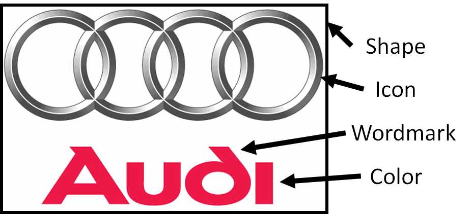
Logos are the visual essence of a brand, representing its identity and values. Wikipedia defines a logo as a “graphic mark, emblem, or symbol used to aid and promote public identification and recognition.” However, not all logos are created equal in the eyes of consumers. Let’s explore the key elements of logo design, including shape, icon, wordmark, and color, to help your small business create a memorable and effective logo.
The Ideal Shape

According to branding expert Al Ries in his book “The 22 Immutable Laws of Branding,” the ideal shape for a logo is horizontal, measuring two and one-fourth units wide by one unit high. This format proves effective across various mediums, from buildings and brochures to letterhead and advertisements. Horizontal logos, in particular, shine in retail establishments, where vertical logos face a disadvantage, especially in the neon-lit chaos of the retail world.
The Power of the Wordmark and Icon


While the shape of a logo is vital, the wordmark, which is the word or letter in the logo, and the icon or symbol are often overrated, according to Ries. Some brands like Apple use only the icon of an apple with a bite taken out of it, which is universally recognized today. Google uses no icon and only a wordmark that features its name in a clean and colorful custom font. Over the years, Google has experimented with various iterations of this logo, but it consistently features only the company name without an accompanying icon or symbol.
However, more often than not, in the realm of logo design, the wordmark and icon are combined to serve as a practical and memorable component of the brand, at least at first. The typeface used in the wordmark can help or hinder the communication process, but only very slightly. As David Ogilvy, once widely hailed as the Father of Advertising, put it, “No woman says, I would have bought that detergent except they had to go and set the headline in Futura Demibold.“

The wordmark is often more important than the icon when a brand is new. The “Nike” wordmark gave meaning to the swish icon. Only when the icon has been associated with the wordmark over a long period of time does the icon eventually come to represent the name in a kind of rebus effect, but it’s still the wordmark that carries the majority of the brand’s power.
The power of a brand name lies in the meaning of the wordmark in the consumer’s mind. For most brands, ultimately, the icon has little or nothing to do with creating this meaning in the mind of the consumer.
The Role of Color in Logo Design
Color can also play a pivotal role in logo design, as different colors convey distinct emotions and messages. Red, often used in retail, grabs attention, while blue communicates corporate stability, as seen in brands like Coca-Cola and IBM, respectively. Industry pioneers have the privilege of choosing the colors of their logo, setting the mood for consumers. The Kissmetrics color guide below highlights the messages that colors send to North American shoppers:
- Yellow – Optimistic & youthful; gets the attention of window shoppers
- Red – Energy; increases heart rate, creates urgency
- Blue – Trust & security; associated with banks and businesses
- Green – Wealth & relaxation; easiest color for the eyes to process
- Orange – Aggressive; call to action: subscribe, buy, or sell
- Black – Powerful & sleek; luxury product marketing
- Pink – Romantic & feminine; product marketing to women and girls
- Purple – Soothing & calm; beauty products
Color Differentiation Strategy


However, the choice of color should also consider the competitors in your industry. For instance, John Deere’s green reflects the agricultural landscape, making it an apt choice for farm tractors. However, Case, a competitor, wisely chose to use red and New Holland chose blue to distinguish themselves from John Deere.


There are many similar examples of competitors forced to choose alternative colors for their logos. In car rentals, Hertz chose yellow, forcing Avis to go with red, and number three, National had to choose green. Coke-Cola chose red since it was kind of the color of cola, so Pepsi was forced to choose blue. Kodak chose yellow, so Fuji chose green. McDonald’s chose yellow, so Burger King chose red and yellow, you get the picture.
There’s a powerful logic behind choosing the opposite color to your major competitors. When you ignore this law of color, you do so at your own risk. However, color consistency cements a brand’s identity in the consumer’s mind regardless of the chosen color.
Related Post: 5 Timeless Rules for Designing a Company Logo That Lasts
In conclusion, logo design is a delicate art. Shape, wordmark, icon, and color are the key ingredients that can make your logo stand out and connect with your target audience. Remember that a logo’s ultimate power lies in the meaning of the brand’s name in the consumer’s mind. So, when crafting your small business’s logo, consider these elements to create a logo that resonates and aids in public identification and recognition, just as a logo should.
What does your logo look like?


