Take a look at the logos for Twitter (now X), Facebook, and LinkedIn. Notice anything? All three rely on blue as their primary brand color. That’s not just a coincidence—it’s science, strategy, and maybe a bit of Chris Pine’s baby blues all rolled into one.
Lately, I’ve been talking with clients about the small visual cues that influence customer behavior. Whenever I bring up branding and share how these massive companies use color, someone inevitably says, “Well, of course! Google, Facebook…they’re monopolies!” That might be a debate for another day, but the color part? That’s very real—and very intentional.
According to ColorMatters, 40% of people worldwide say blue is their favorite color. But beyond preference, colors have a measurable impact. One study found that 85% of shoppers cite color as the primary reason they purchase a product. And using consistent colors can increase brand recognition by up to 80%
That’s not just trivia—it’s a wake-up call for small businesses.
The Psychology of Color in Branding
Think of your brand as a silent ambassador. Before anyone reads a word of your pitch or hears your voice on a call, they’re already forming opinions based on your visuals. Color is one of the first things they notice. And it has the power to shape how people feel about your product or service—even before they know what you sell.
According to Constant Contact’s social media content manager Azure Collier, “Think about the action you want your audience to take and choose colors that are the right fit.”
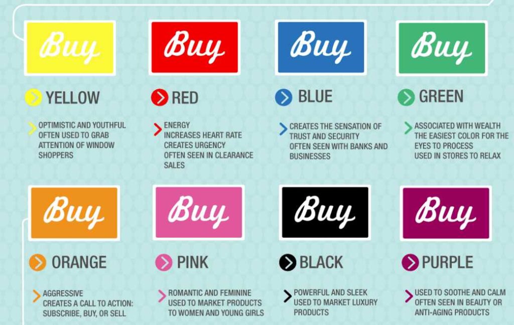
Here’s a helpful breakdown of color meanings from Kissmetrics (Infographic) for North American shoppers:
Yellow – Optimistic and youthful; grabs attention, especially for window shoppers
Red – Urgency and energy; raises heart rate and encourages action
Blue – Trust and security; commonly used by financial institutions and tech brands
Green – Wealth, relaxation, and balance; easiest on the eyes
Orange – Aggressive and energetic; perfect for CTAs like “Buy Now”
Black – Sleek and powerful; used in high-end or luxury marketing
Pink – Romantic and feminine; often found in women’s and girls’ products
Purple – Calming and elegant; a go-to for beauty and wellness brands
It’s worth noting that cultural interpretations of color vary. For example, while white represents purity in the U.S., it can signify mourning in parts of Asia. Always consider your audience.
How Color Drives Action
Color is not just about branding; it’s a tool for conversion. Have you ever noticed how the “Buy Now” or “Subscribe” buttons on websites are often red or orange? That’s because those colors spark urgency. Conversely, if you want your customer to feel reassured—say, when entering credit card info—blue or green are safer bets.
Consider this when designing your:
Website
Email templates
Product packaging
Event materials
Business cards
Even something as simple as choosing a bolder, higher-contrast color for your call-to-action can boost click-through rates.
Color in Newsletters: A Missed Opportunity
Your email newsletter might be full of great insights, but is it visually engaging? Too often, small businesses default to black text on a white background, maybe throwing in a stock photo or a logo. But what if your content had more punch with the strategic use of color?
Try:
Using yellow to highlight tips or new arrivals
Adding a red border to time-sensitive promotions
Incorporating blue in headers to build trust
Keeping buttons consistent in color so readers know what to click
Most email marketing platforms (like Constant Contact, Mailchimp, and ConvertKit) allow you to create brand kits and apply consistent color palettes. This reinforces brand recognition every time your email lands in someone’s inbox.
Color Choice as a Differentiator
In a sea of competitors, visual consistency helps your brand stand out. If your competitors are leaning heavily on safe, muted tones, a pop of green or purple might give your materials a fresh, inviting feel. Or maybe everyone else is red-hot with urgency—what if your calm, confident blues feel more trustworthy by comparison?
Your brand doesn’t need to be loud. It just needs to be intentional.
Don’t Just Pick Your Favorite Color—Pick the Right One
We all have color preferences. But when it comes to business, the question isn’t “What color do I like?” It’s “What color will make my audience trust, click, or buy?”
Color isn’t decoration—it’s persuasion.
So go ahead, revisit your color palette. Test different combinations. Look at your email metrics, bounce rates, and A/B test results. Then optimize.
You don’t have to be the Blue Man Group… but a little strategic blue might go a long way.
How intentional are you with the colors you use in your branding—and could a simple change help your business stand out or drive more customer action?